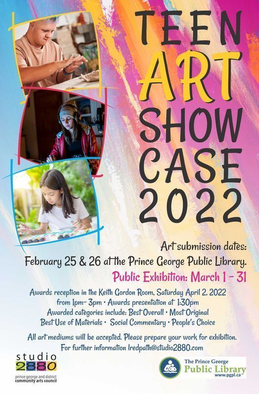
Teen Art Showcase
Prince George Public Library
Print Redesign | Advertising
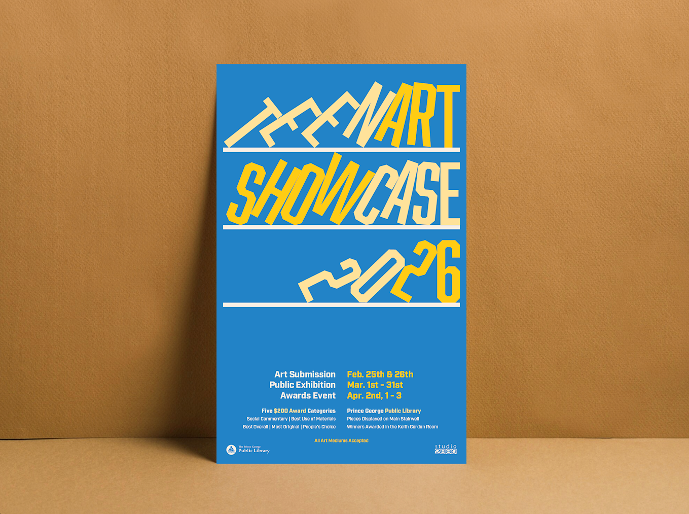

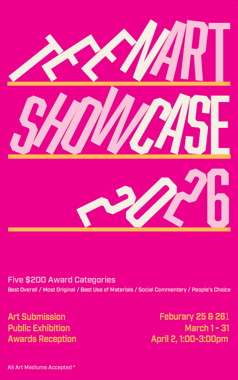
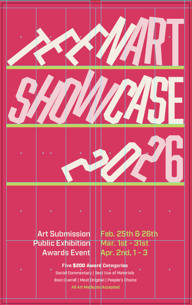
Process and concepts
Draw, build, revise
Throughout my process I got feedback from various groups, including peers, my family, and teacher. This helped me ensure the readability of the bookcase design. Before I settled on the blue colour palette you see now, I had explored many colour combos. I felt that a pink colour palette similar to the library's original two designs was appealing. However, bright pink is not neutral, as the poster should be for an event aimed towards all teens. So I did some research on the library’s colours, and visited Pinterest to find some blue shades that generated a feeling of movement and calmness.


No items found.
Results
Originals